Logo Animations: Fashion Branding
Role - Designer, Animator
• •
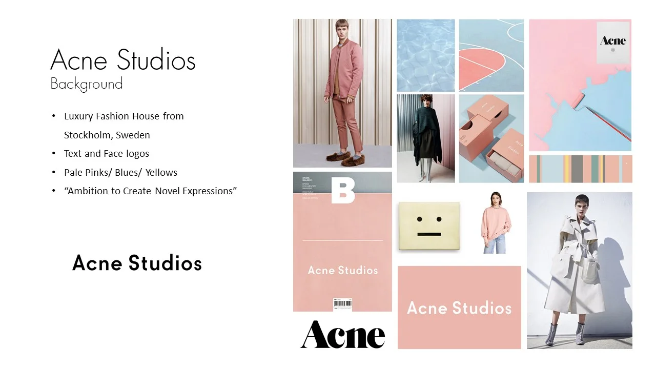
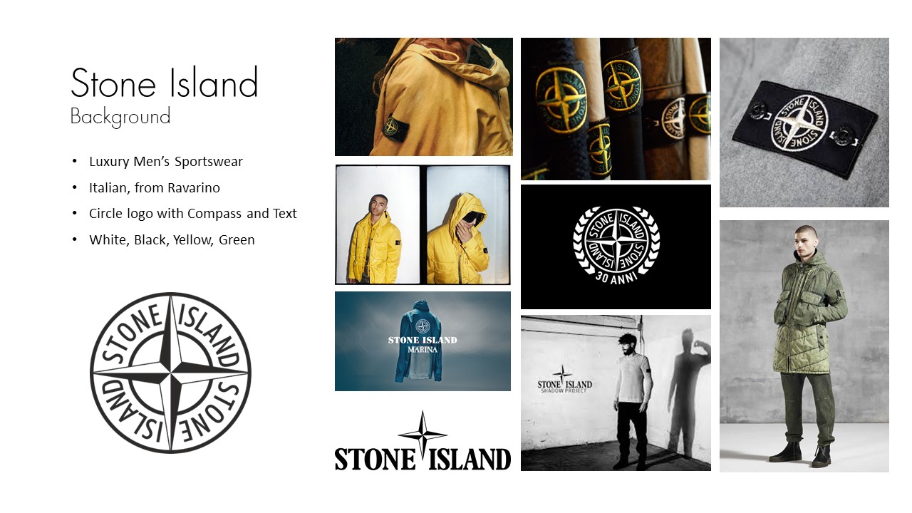
A few mock logo animations I made for some fashion designers/design studios that I love, namely Acne Studios, Stone Island, and Raf Simons.
Acne’s branding, focused around pastels and clean silhouettes, called for a simple, smooth logo animation. I decided to use typographic and line animations to transition from Acne’s signature face into their main logo, focusing on smooth and exaggerated motion.
Raf Simons, a menswear designer, features a more grungy and dark branding. I used their RS/SR stacked logo to create an interlocking pattern through different textures that would build and ultimately form Raf Simons’ full logo. This, combined with a black and white pallette, created an active but dark animation with sharp cuts between each phase of the logo.
Stone Island is a sportswear brand focused on adventure and exploration. Their main logo, a circle logo representing a compass, gives a pretty clear indicator to how the brand feels as a whole. For the logo animation, I focused on a spinning compass that scaled down from full screen. The compass arms build, spin, and reveal the text. As the arms come to a rest, the outer circles close forming the full logo.
• •
• •


